Bike Perfect Verdict
If you don’t expect advanced off-road features, and you ignore some menu frustrations, the Explore 2 is a solid navigation unit with a great touchscreen and a good price.
Pros
- +
Clear, adjustable mapping on and off-road
- +
Good touchscreen
- +
Excellent GPS reception
- +
Clear navigation instructions
- +
Reasonable price
Cons
- -
App and menus could be simpler
- -
Rerouting doesn’t do u-turns
- -
No MTB-specific functions
- -
No Trailforks map in UK
- -
Route suggestions are weak, especially off-road
Why trust BikePerfect
The Explore 2 is designed as a midpriced touchscreen GPS device for riders whose main need is navigation rather than detailed training sessions or analysis. It showcases a lot of the latest Garmin technology that you would find on the $599 / £520 Edge 1040 – one of the best MTB GPS computers – in a smaller, more basic package.
It’s aimed at recreational all-round riders with few specific functions for off-roaders, but even Garmin’s core mapping can be decent for off-Tarmac use. With a reputation for strong satellite reception and with touchscreen functionality at a good price, the Explore should be a promising buy. I found it unnecessarily complicated in some areas, mainly around setup and menus, and like many other GPS models, limited in off-road road route generation. But once you’ve settled on the handful of functions you want to use most of the time, out on the trail it was a reliable companion.
Design and specifications
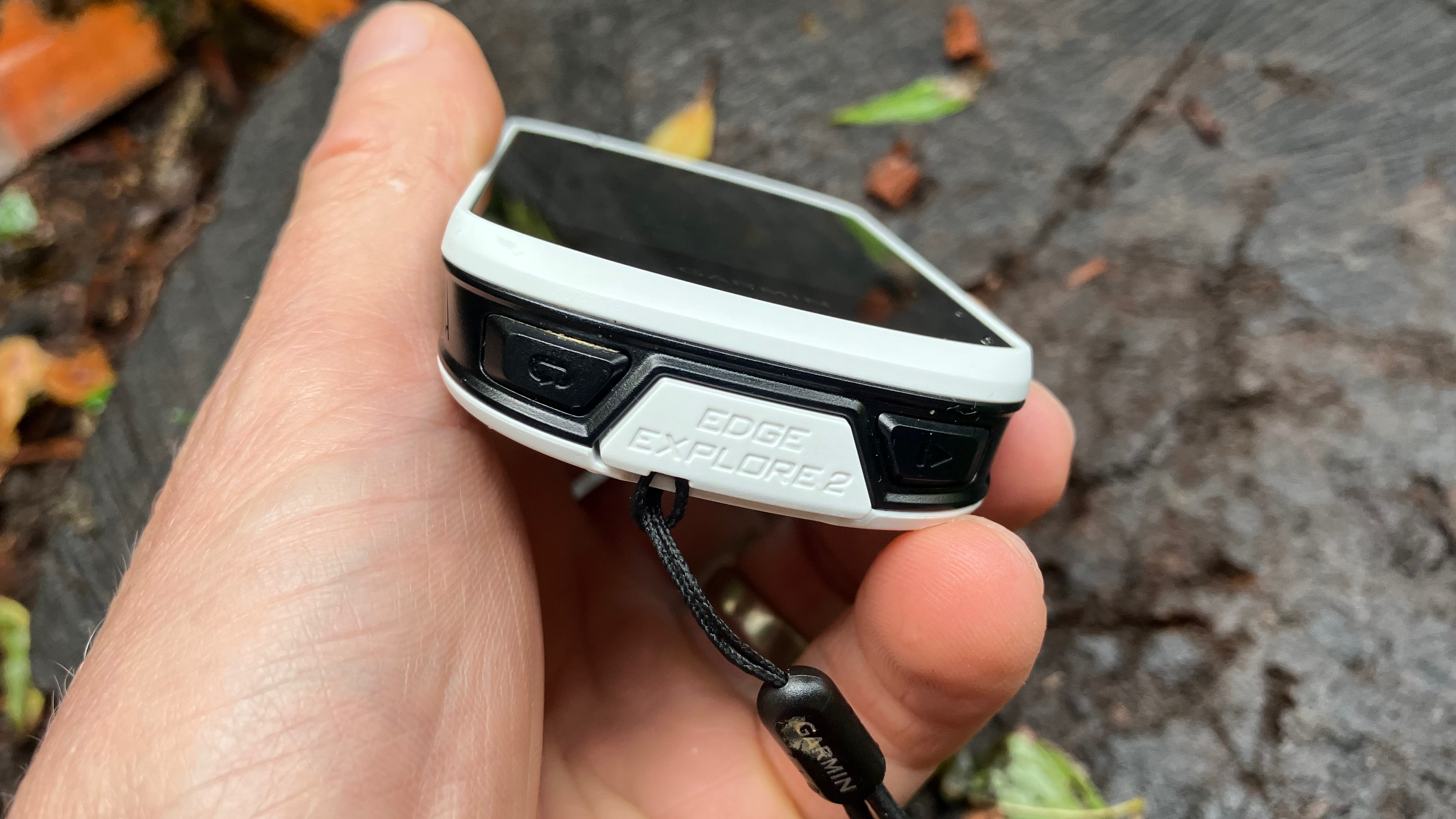
The Edge 2 is a medium-sized 10cm long with a 3in, 240x400px touchscreen surrounded by a reasonably big bezel. It has a physical on-off button, and a start/stop button and a lap button, but apart from that you control all functions with the touchscreen.
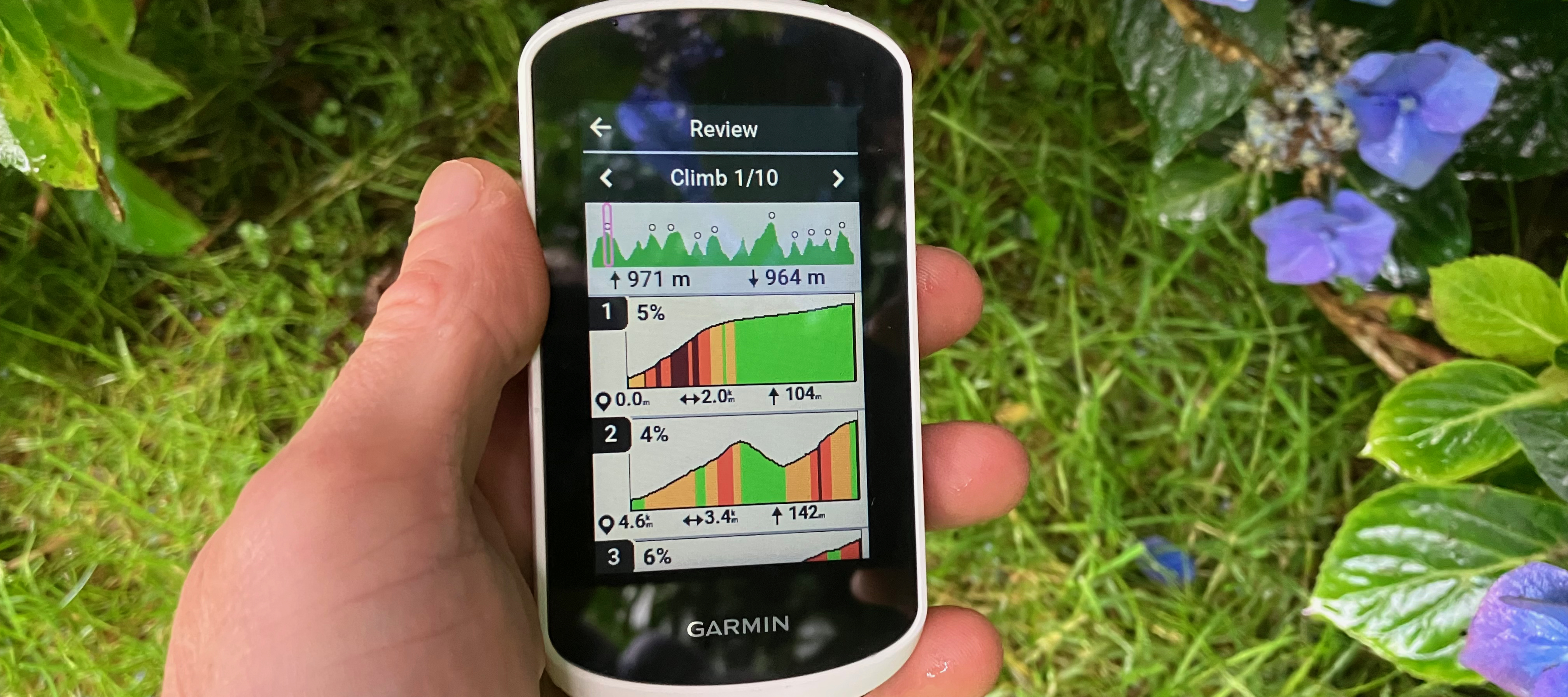
In terms of functionality, the Edge 2 is almost unrecognisable compared to the previous Edge from 2018. It now has the same user interface as the Edge 1040, and functionality highlights include much wider sensor compatibility, the excellent Climb Pro functions which give really clear gradient profiles of the climbs in your ride, global free cycle maps, and basic e-bike connectivity. It can also let friends see where you are and send alerts if you crash.

Connectivity-wise, it’s a little cut down compared to the 1040, but there’s still a lot going on. You can connect to your heart rate monitor, power meter and smart trainer as you’d expect, and compatible lights and radar, and compatibility with some e-bikes. But it doesn’t have a full suite of electronic drivetrain options, for example.
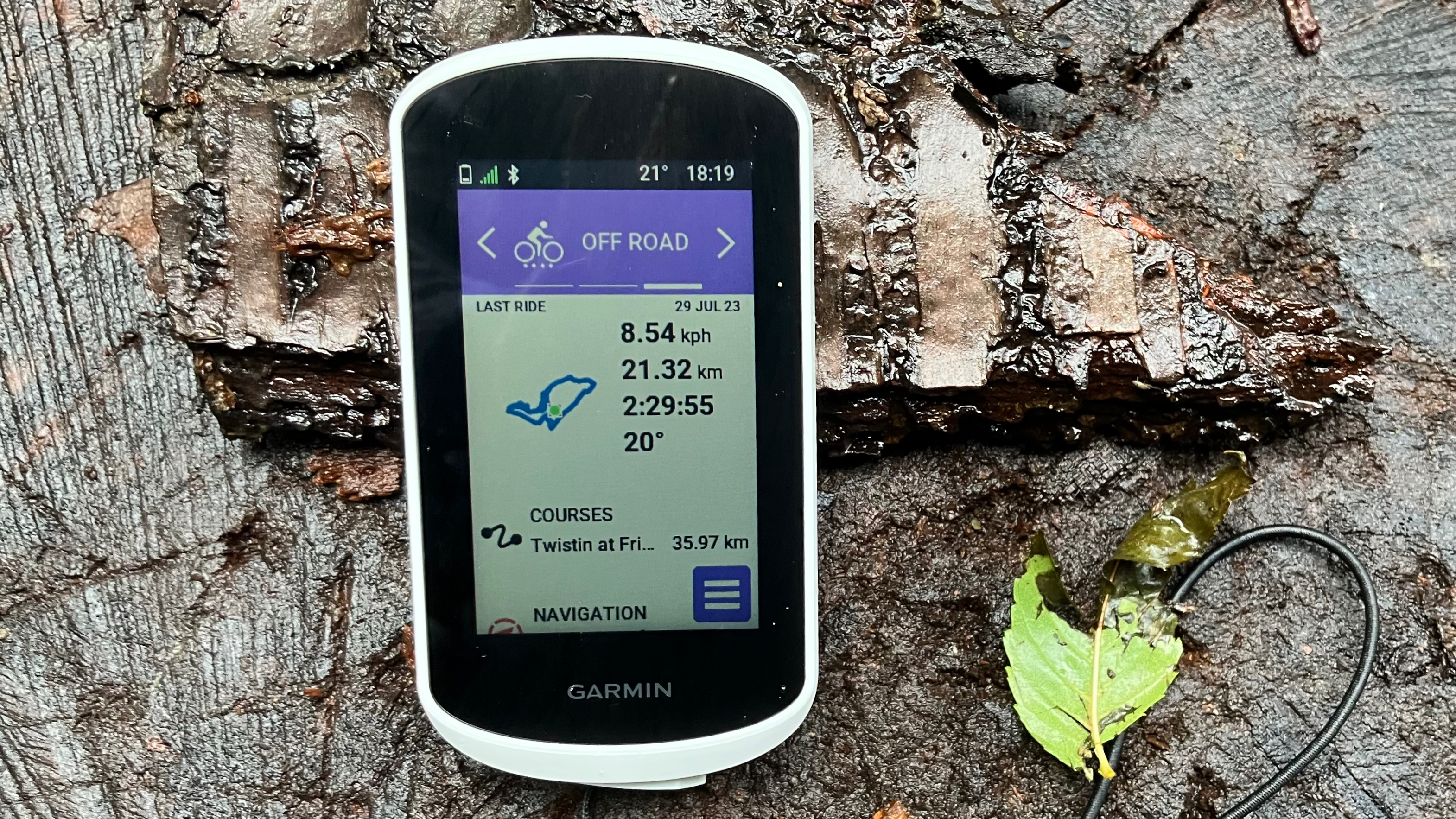
You can leave your training and navigation screens on the default settings or customize them with different options per bike type. There’s a huge amount to choose from and you can choose how many fields you have on a screen, and how many screens you can swipe between. You only get three bike types to play with, and one of them is pre-set to ‘indoor’, whereas on other Garmins you can create as many as you want.
If you’re interested in performance metrics, you can do much more than show current power or heart rate, with options for average across the ride, 3-second average, zone, and more. Terrain and riding metrics include elevation, gradient, distance, climb remaining, distance to next waypoint, and dozens more options, as well as the regular timers and lap details.
It includes some training feedback like calculations of your VO2 max and recovery time, if you care about those things or trust your device to calculate them, but if you want to follow things like interval sessions, you’ll have to look to a more expensive unit.
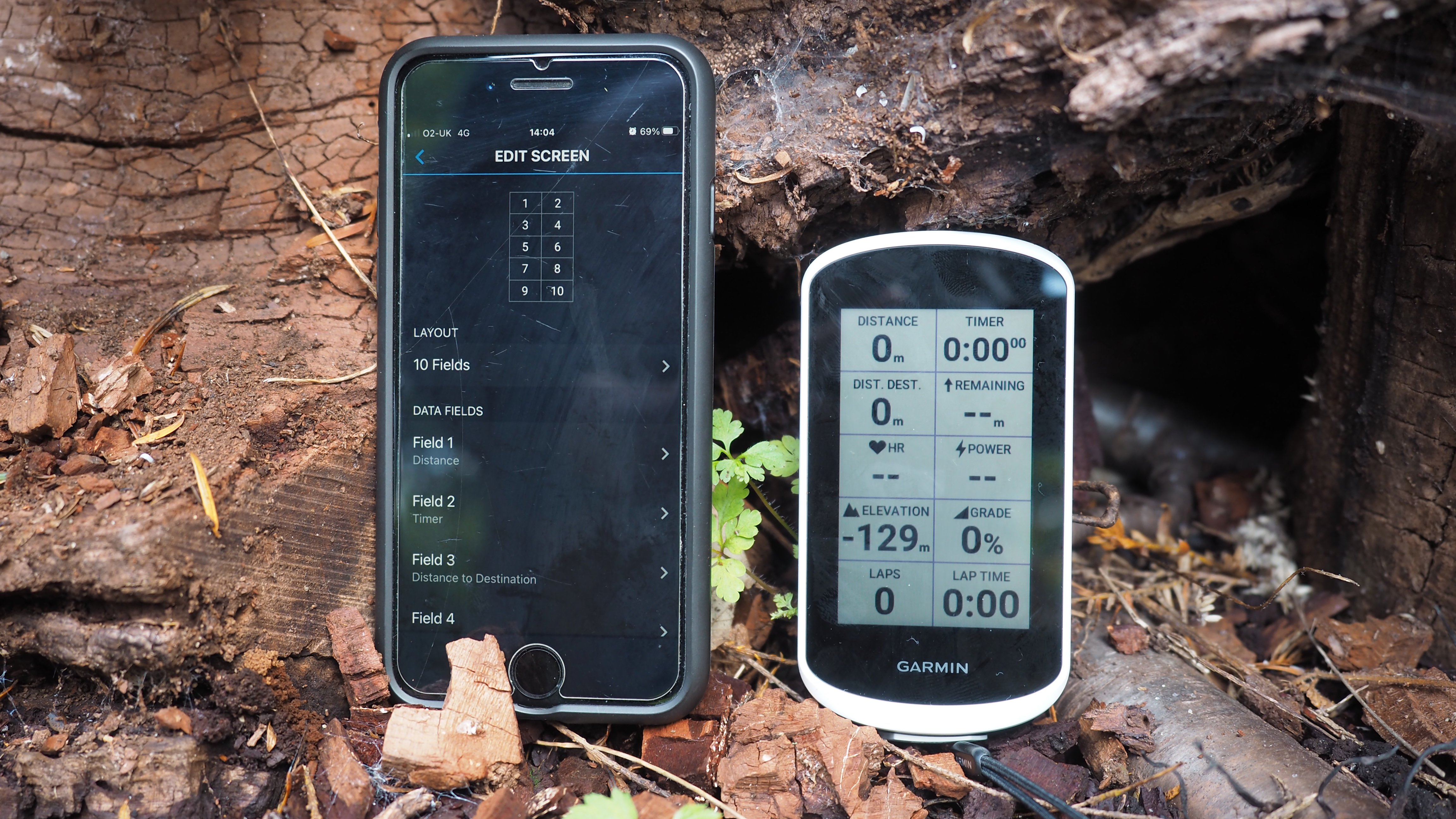
A lot of the setup can be done via the Garmin Connect app on your phone, though you can also press a field on the device screen and change it to another one, which I found particularly handy mid-ride when I was experimenting with the fields.
Compared to its more expensive Edge 840 and 1040 cousins (and the older x30 series like the Edge 1030), the Explore 2 doesn’t have the fun mountain bike specific metrics like jump time recording, and the ‘Flow’ and ‘Grit’ measures that tell you how smoothly you were riding and how technical it thought the ride was. In the UK at least, it also doesn’t have Trailforks mapping built in, though you can add this if you have a Trailforks subscription.
The jury’s out on the value of integrated Trailforks mapping on Garmins, so it’s probably not a deal breaker for Explore 2 purchasers. Many Trailforks users prefer using the app on their phone anyway, and people who want to do route planning generally do it on a big screen before their ride, and transfer it onto their Garmin. When you're out on the trail, the Trailforks map certainly shows more singletrack in some areas, and color grades it, but the Garmin base map labels singletrack in popular areas like the Surrey Hills to help with basic orientation.
Battery life is around 16 hours, with over 20 on low-power mode. Charging is via USB2, and the unit has really good cover on the socket, which isn’t the case on all devices.
Performance
I wanted to like the Explore 2 a lot more than I did, though once I’d chilled out about the bells and whistles it promised to do and should have done better, and focused on the basics, I did find it a reliable companion. Having read other enthusiastic reviews, I’d hoped it would take the things I love about my trusty non-touchscreen Edge 530, and fix the things I didn’t. The things I love about the 530 include faultless GPS positioning, really clear turn by turn instructions, proper all-day battery life and pretty decent mapping, even off-road.
While the things I don't love about that unit are – useless guidance when you went off course, endless submenus to do even basic things like zooming. And slightly shonky syncing and file uploading.
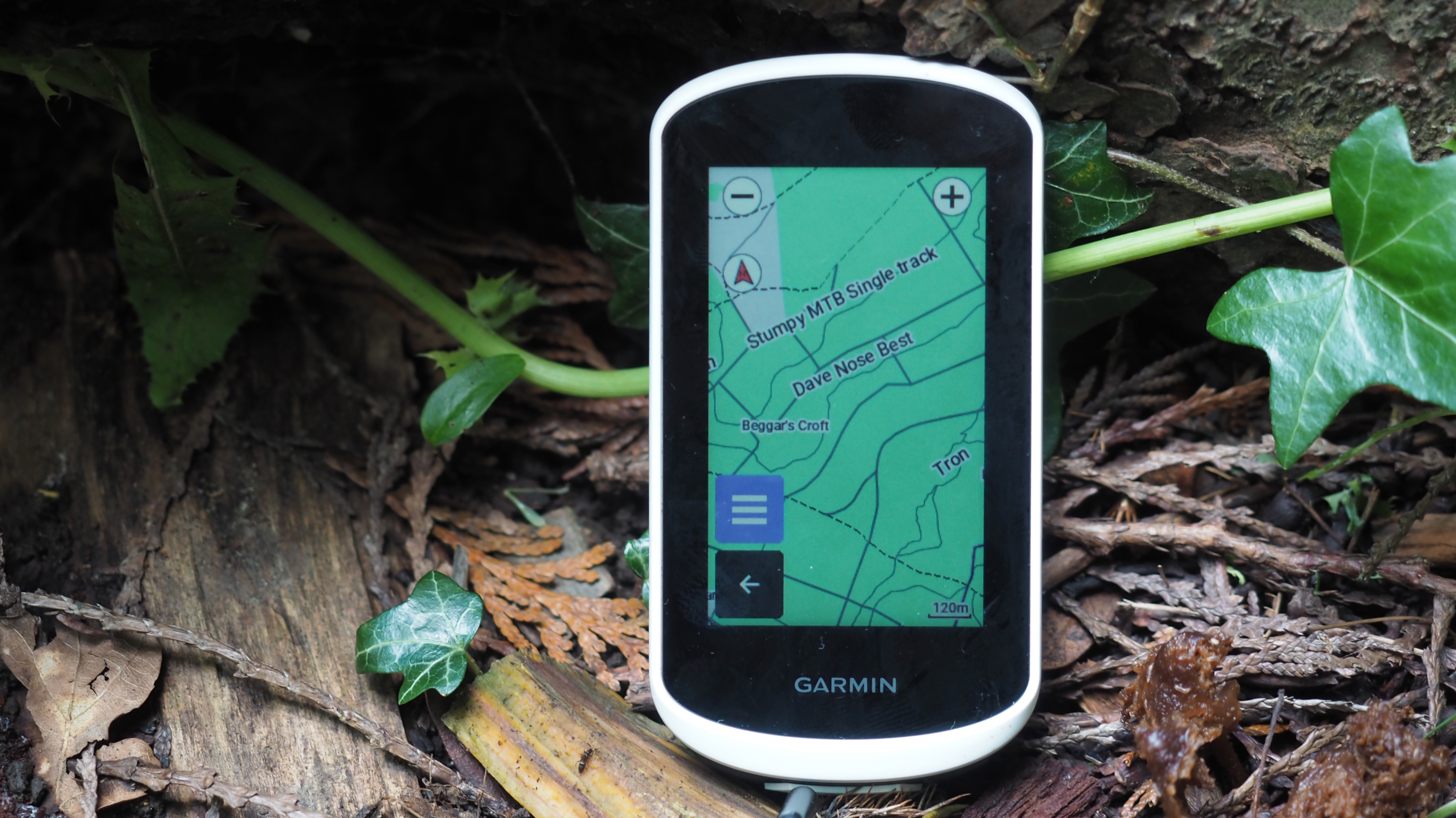
The good news about the Explore 2 is that the mapping, which has always been a Garmin strength, is even better than before. I appreciated high-contrast mode for easier reading, and the option of making names bigger on the map. You can also choose to retain more detail than normal as you zoom out, which is a benefit for planning a route on the hoof, as you can see the big picture without losing place names and road details. The options of having popular routes and busy roads slightly highlighted by default is handier than I thought too.
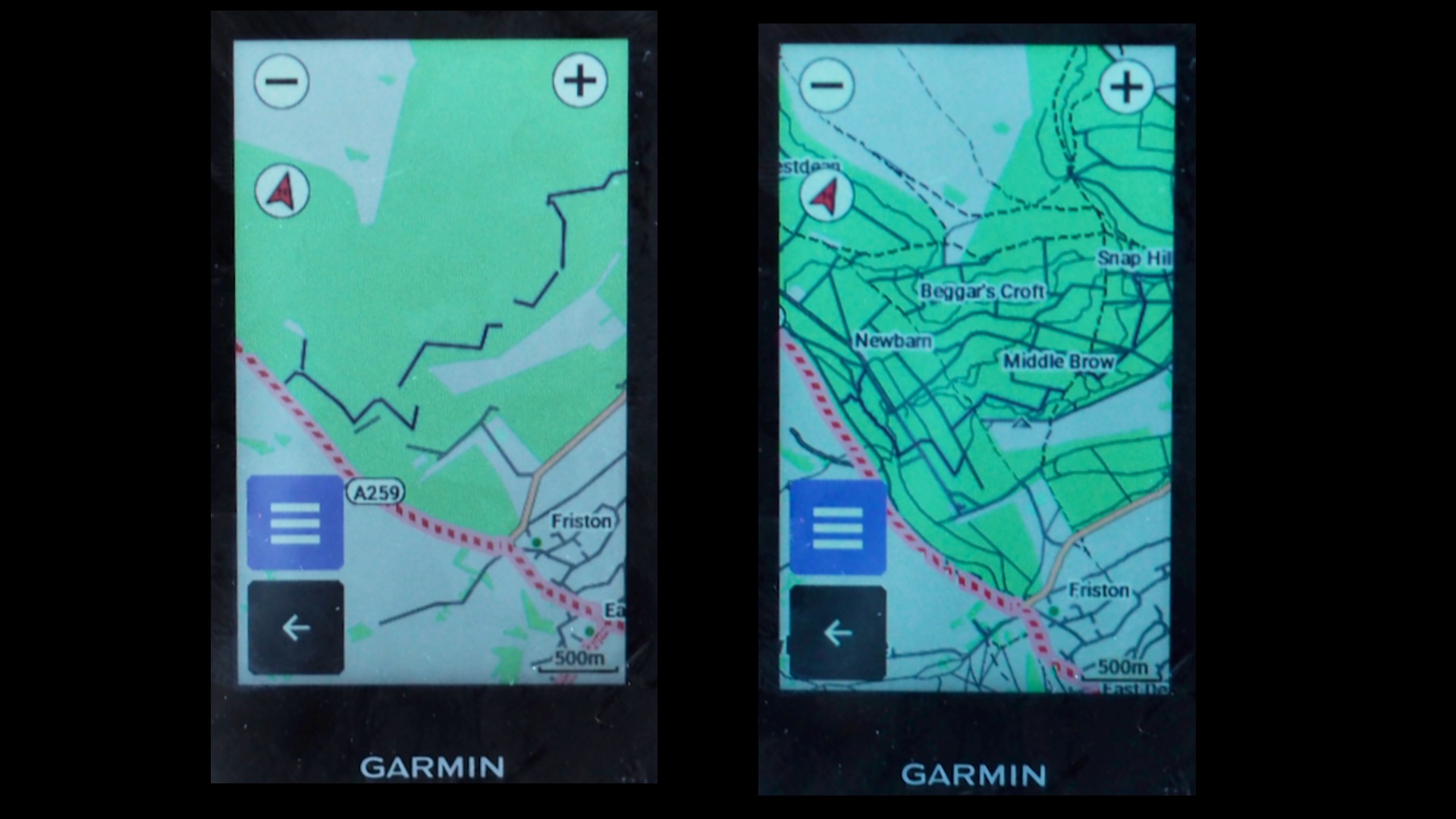
The turn instructions are really clear too, and the touchscreen is sharp and accurate, even in the rain. The base map is based on Open Streetmap, which means it does a pretty good job of distinguishing between bridleways, footpaths and other tracks, and it labels the names of trails in well established MTB hotspots, even if it’s not always easy to determine where the trails start and end amongst the other trails on the screen.
The big screen really suits the excellent Climb Pro function and the flexible way you can combine the information you want while you ride. Add the easy touchscreen for zooming, and it’s not a difficult choice to make over the old 530, which is still available at £220
Once you’ve got used to it, it’s a fine device for simple everyday use on and off-road, like ad hoc riding with a map, following pre-planned routes, hassle-free connectivity to devices like heart rate monitors and power meters, and using the basic training features.

But beyond that I often found it frustrating – especially compared to something like the new Sigma Rox 12.1 Evo which I tested recently. Options – like routes – are still buried in submenus on the companion app; similar settings on the device may be under multiple menus; app syncing literally took all afternoon at one point;
Other niggles are common to other GPS brands too: the ability to put in a simple postcode is thwarted by the fact that it doesn’t recognise UK postcodes, for example. And promising features like the ability to find cafes or bike shops are limited by the fact that you just get a list of names, and the database is questionable, like a local bike shop that shut in 2017, and a cafe which is actually a school breakfast club. It is pretty useful if you know the name of the place you’re looking for, though.

Some things are just a bit confusing at first, at least to my brain. The homepage has ‘location search’ and ‘navigation’, for example, which share some options but not others. (Location search is the quickest option, you just put in a town, feature or business name.) And even uploading a GPX file wasn’t in the instructions, took more Googling that I’d expected, and remains more of a faff than on the Sigma.
Things I’d hoped would be much better included the integrated versions of the recommended Wikiloc routes app and the Trailforks app, both of which you can activate via Garmin’s own (separate) app manager, and both of which do little more than give bare lists of routes, unless you’ve favorited a Trailforks route on another device already. You’re best off keeping things simple by planning or downloading routes on your laptop and uploading them to the device beforehand.
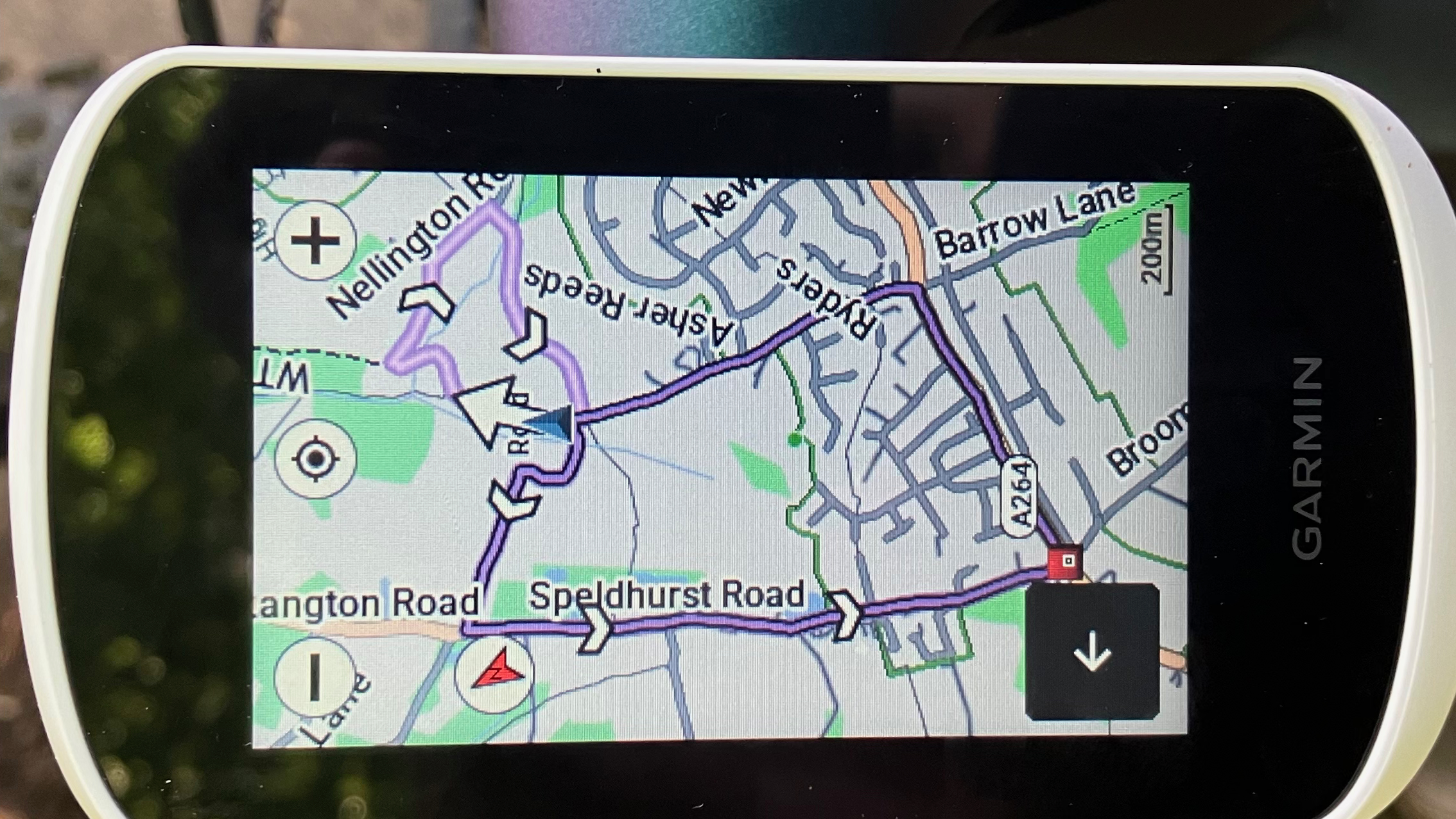
And I had trouble with the one thing I had highest hopes for over the 530, which was rerouting. Other reviewers have found it quick and logical, but I had some weird experiences where overshooting a turn by 20m resulted in a complete recalculation of a long route to the finish point, rather than the simple instruction to turn around and get back on the course. When I phoned Garmin they confirmed that it doesn’t do U-turns. (As a partial workaround, you can switch rerouting off and just get an off-course alert.)
The ‘suggest a ride’ and ‘return to start’ was fine on road, and better than the Sigma, but still a lucky dip of illegal footpaths and legal tracks off-road, so I wouldn’t rely on it too heavily on knobbly tired rides, even with the customization options that in theory let you weight route calculation to avoid ‘narrow trails’ if you want to.
Verdict
I wish the Explore 2 had tried to do less, better, but that's because I mainly wanted it for navigation. When you’re actually riding, the core mapping, GPS reception and readability is great, as per Garmin’s strengths, and it’s got a good touchscreen.
Some of the frustrations are to do with one-off setups or the companion app. And you get used to other things like the buried menu options and convoluted route upload – you just wish they could have been better. Really good singletrack integration would be amazing, but that seems some way off still for any unit. The only thing I’d find an ongoing annoyance on the trail with the Explore 2 is the fact that the rerouting won’t do U-turns.
So, day to day, for riding, it’s a decent value unit. But I’ll still keep my fingers crossed for some radical software updates in the future…
Tech specs: Garmin Edge Explore 2
- Price: $299.99 / £249.99 / €299.99 – ($399.99 / £339.99 / €399.99 with on-bike power connectivity)
- Weight: 105g
- Size: 106 x 54 x 17mm (depth excluding mount)
- Key features: Navigation with re-routing, multi-band GPS, 3in touch screen, companion app, customisable views, phone notifications, safety alerts, IPX7 water resistance, group ride features
Sean has old school cycle touring in his blood, with a coast to coast USA ride and a number of month-long European tours in his very relaxed palmares. Also an enthusiastic midpack club cyclocross and XC racer, he loves his role as a junior cycle coach on the Kent/Sussex borders, and likes to squeeze in a one-day unsupported 100-miler on the South Downs Way at least once a year. Triathlon and adventure racing fit into his meandering cycling past, as does clattering around the Peak District on a rigid Stumpjumper back in the day.
Height: 173cm
Weight: 65kg
Rides: Specialized Chisel Comp; Canyon Inflite CF SLX; Canyon Aeroad; Roberts custom road bike
